Table of Contents
Data View Widget
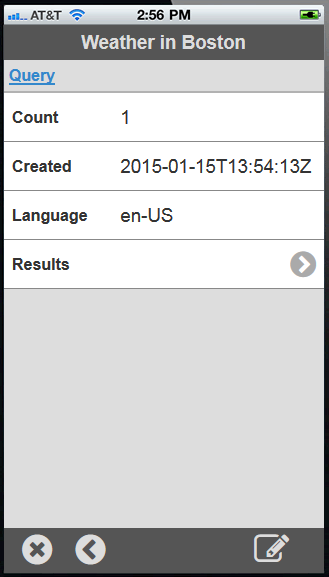
The Data View Widget easily renders any dataset, which can be a JavaScript object, a JSON string, or an XML string. These are typically returned from database queries or REST API calls. The dataset could be as simple as a single set of properties, or a complicated nesting of arrays and objects. The Data View Widget enables a user to navigate through the dataset, and also to modify its contents.
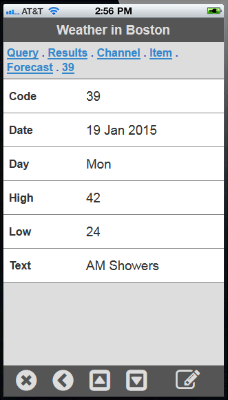
The Data View Widget can optionally show a header if given a title option. As a user navigates into levels within a dataset, the Data View Widget will leave a breadcrumb trail near the header so the user can quickly jump back out to a higher level. The widget's control bar also has an egress button that navigates back to the previous level. The breadcrumb trail will also display a map marker icon when it detects that the currently viewed record is showing geographical location.
This document describes the Application Programming Interface (API) for the Data View Widget. There are two ways to invoke the Data View Widget: with a field drawn with fixed dimensions on a page, or as an event popup that is rendered full-screen.
Invoke as a ViziApps Field
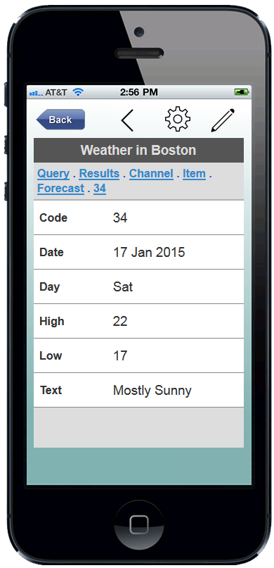
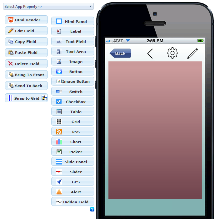 To invoke the Data View Widget as a field drawn on a ViziApps page, first draw a field. An Image Field is convenient because you can see the full background, as in the following screenshot. If using an Image Field, set the image scaling to Scaled Fit.
In this example, the field is named editorField. The Data View Widget is invoked using the name of the ViziApps field, and would typically be created once, in the app's HTML Header, after the app has started. Note the jQuery convention to making reference to the ViziApps field by name: $('#editorField').
$( document ).on( "DOMContentLoaded", function()
{
    $('#editorField').dataview();
});
Whenever a dataset is available at a later time, it can be passed to the Data View Widget as a value:
$('#editorField').dataview( "value", dataset );
Invoke as a Popup Event
It is not necessary to pre-define a field; the Data View Widget can be invoked as a full-screen popup. The dataset is passed as a parameter, and an optional title can be added.
$.viziapps.dataview({ value: dataset, title: "Important Information" });
Control Bar
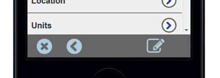 When invoked as a popup, the Data View Widget will always incorporate a control bar at its bottom. When invoked as a ViziApps field, the control bar is included by default but may be removed as an option (see Options, below). The control bar includes:
- An exit button, which closes the popup window
- An egress button to navigate back up through a dataset
- An edit button which enables editing of the dataset, but won't appear if options.editable is false
- Array Up and Array Down buttons, which only appear when navigating through an array
Editing
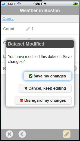
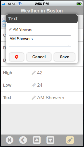
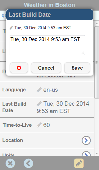 When a user clicks the edit button in the control bar, the Data View Widget enters edit mode. The edit button will be highlighted, and all editable values will be marked with an edit (pencil) icon. Tapping on any editable field will popup an edit dialog which presents the user with the field name or key, the original field value, and a control to enter in a new value.
Options
Various options are available to change the appearance and behavior of the Data View Widget. Options may be included when the Data View Widget is created, as in the following:
$.viziapps.dataview({ value: dataset, editable: false });
Options may also be added any time after the Data View Widget has been created:
$('#editorField').dataview( "option", "editable", false );
The following options are available for the Data View Widget:
| title | string | Title for the dataset, shown in a header |
|---|---|---|
| editable | boolean | Show the editing controls and allow the dataset to be edited |
| editMode | boolean,string | Enable or disable editing, or “toggle” |
| showControls | boolean | Show the built-in control bar with controls; ignored for popups |
| niceNames | boolean | Automatically convert dataset keys to text in a title style |
| arrayNames | boolean, number, string | Convert numeric array indices to a readable text property within each row's objects |
| nameMap | string map | A map object of key names with formal names to show the user |
| style | list | CSS style overrides to the default theme |
| icons | list | icon definition overrides to the default icons |
| strings | list | All text within the widget, including buttons |
| fadeDuration | number | Number of milliseconds for visual transitions. Set to zero to eliminate animations. |
Event Callbacks
An app can monitor event callbacks to catch changes in the dataset.
| change | dataviewchange | Whenever a user saves any change to the dataset |
|---|---|---|
| control | dataviewcontrol | Whenever a control bar button is pressed |
| close | dataviewclose | When the Data View Widget is closed |
Callbacks may be defined when the Data View Widget is created:
$('#editorField').dataview( {
    change: function( event, ui )
    {
        console.log( 'change: ' + ui.original + ' -> ' + ui.value );
    },
    close: function( event, ui )
    {
        console.log( 'close: ' + ui.changes + ' -> ' + JSON.stringify( ui.value, null, '  ' ) );
    }
});
Callbacks may also be defined as a jQuery event after the Data View Widget is created:
$('#editorField').bind( 'dataviewchange', function( event, ui )
{
    console.log( 'change: ' + ui.original + ' -> ' + ui.value );
});
$('#editorField').bind( 'dataviewclose', function( event, ui )
{
    console.log( 'close: ' + ui.changes + ' -> ' + JSON.stringify( ui.value, null, '  ' ) );
});
Some callbacks allow the handler to return false, which prevents the widget from processing its default action. All control events allow the app to hook the control buttons in this way.
Methods
| value | Get the current dataset being edited | |
|---|---|---|
| value | record | Pass a new dataset to edit, replacing any current dataset |
| egress | Have the Data View Widget navigate back one level | |
| arrayUp | Move to previous record in a dataset array. | |
| arrayDn | Move to next record in a dataset array. | |
| close | Close the Data View Widget, which generates a save/discard dialog |
Methods may be called using the named field:
var currentRecord = $('#editorField').dataview( "value" );
$('#editorField').dataview( "egress" );
When invoked as a popup, you can store the widget's ID in the create callback:
var widgetID;
$.viziapps.dataview({
    value: dataSet,
    create: function( event, ui ) { widgetID = ui.id; }
});
function getWidgetValue() {
    return $( '#' + widgetID ).dataview( "value" );
}
